In diesem Beitrag geht es um das Thema Farbtheorie und wie Farben wahrgenommen werden. Es werden Begriffe wie Hue, Wert und Sättigung erklärt, sowie Tipps gegeben, wie man harmonische Farbkombinationen erreichen kann. Darüber hinaus werden Ressourcen für weiterführende Literatur und Lernmöglichkeiten zu Farbtheorie aufgeführt.
What is Color Theory?
Understanding the Basics of Color Theory
Color theory is a concept that explores how colors interact with each other and how they can be combined to create harmonious or contrasting color schemes. It involves the study of color wheel, color harmony, and the emotional impact of colors. By understanding color theory, you can create visually appealing designs, whether you are a graphic designer, artist, or just someone interested in the world of colors.
The Importance of Color in Design
Colors play a crucial role in design, as they can evoke certain emotions, convey messages, and create visual interest. Different colors have different meanings and associations, and using the right color scheme can significantly impact the overall look and feel of a design. Whether you are designing a logo, website, or interior space, choosing the right colors based on color theory can make a big difference in how people perceive your work.
Practical Applications of Color Theory
Color theory is not just a theoretical concept; it has practical applications in various fields. For example, interior designers use color theory to create harmonious color schemes for living spaces, while marketers use it to evoke specific emotions in their branding materials. Understanding color theory can also help you mix and match colors effectively, whether you are painting a masterpiece or designing a unique outfit.
Enhancing Your Creativity with Color Theory
By learning and applying color theory principles, you can enhance your creativity and take your design skills to the next level. Experimenting with different color combinations, understanding color psychology, and using color effectively in your projects can help you stand out as a designer. Whether you prefer bold and vibrant hues or subtle and calming tones, color theory can guide you in creating visually stunning and impactful designs.
In conclusion, color theory is a powerful tool that can help you unleash your creativity and create visually appealing designs across various disciplines. By understanding the principles of color theory and applying them in your work, you can communicate effectively, evoke emotions, and make a lasting impression with your use of color.
Color is in the Beholders’ Eyes
Farben spielen in unserem Leben eine große Rolle, sowohl bewusst als auch unbewusst. Von der Wahl der Kleidung bis hin zur Raumgestaltung beeinflussen Farben unsere Stimmung und Emotionen. Wussten Sie, dass dies auf der Color-Theorie basiert? Diese Theorie untersucht, wie Farben miteinander interagieren und wie sie von uns wahrgenommen werden.
Warum fühlen Sie sich in einem Raum mit warmen Farben wie Rot oder Orange energiegeladen, während kühle Farben wie Blau oder Grün eher beruhigend wirken? Die Antwort liegt in der Psychologie der Farben. Rot kann die Herzfrequenz erhöhen und den Appetit anregen, während Blau mit Ruhe und Entspannung in Verbindung gebracht wird. Diese subtilen Nuancen beeinflussen, wie wir uns in verschiedenen Umgebungen fühlen.
Die Farbpsychologie spielt auch im Marketing eine entscheidende Rolle. Unternehmen nutzen gezielt Farben in ihren Logos und Werbekampagnen, um bestimmte Emotionen und Reaktionen bei Verbrauchern hervorzurufen. Rot wird oft mit Leidenschaft und Notwendigkeit assoziiert, während Grün für Wachstum und Harmonie steht. Durch die bewusste Verwendung von Farben können Marken eine starke Verbindung zu ihren Kunden herstellen.
Ob Sie es merken oder nicht, Farben haben eine tiefgreifende Wirkung auf unser tägliches Leben. Von der Gestaltung von Websites bis zur Auswahl von Verpackungen – die Color-Theorie ist überall präsent. Nächstes Mal, wenn Sie sich in einem Raum befinden oder eine Anzeige sehen, achten Sie doch einmal bewusst auf die verwendeten Farben und wie sie auf Sie wirken. Es ist faszinierend zu sehen, wie Farben unsere Stimmung und Wahrnehmung beeinflussen können.
What Are Hue, Value and Saturation?
Understanding Color Theory: Exploring Hue, Value, and Saturation
You may have heard the terms hue, value, and saturation before, but what do they actually mean in the world of color theory? Let’s break it down for you.
Hue refers to the pure spectrum colors – think of the rainbow: red, orange, yellow, green, blue, indigo, and violet. It’s essentially what we think of as the „color“ itself.
Value, on the other hand, refers to the lightness or darkness of a color. A color’s value is what allows us to create contrast and depth in our designs. Light colors have a high value, while dark colors have a low value.
Saturation is the intensity or purity of a color. A highly saturated color is vivid and vibrant, while a desaturated color is more muted and grayish. Saturation can have a big impact on the overall feel of a design.
By understanding these three elements of color – hue, value, and saturation – you can create visually appealing designs that have depth, contrast, and impact. So, the next time you’re working on a project, consider how you can play with these aspects of color to create something truly eye-catching.
Learn More about Color Theory
Understanding the Basics
Color theory is a fundamental concept in art and design. It explores the relationships between colors, how they interact, and how they can be combined to create visually appealing compositions. By understanding color theory, you can create harmonious color palettes, evoke specific emotions, and communicate messages effectively through your work.
Importance of Color Psychology
Colors have the power to evoke emotions, convey messages, and influence behavior. Different colors can have different psychological effects on individuals. For example, warm colors like red and yellow are often associated with energy and passion, while cool colors like blue and green can evoke feelings of calmness and serenity. Understanding color psychology can help you create designs that resonate with your target audience.
Creating Effective Color Combinations
When combining colors, it’s essential to consider factors like contrast, harmony, and balance. Using tools like the color wheel can help you identify complementary, analogous, or triadic color schemes for your projects. By experimenting with different color combinations, you can create visually engaging designs that capture the viewer’s attention.
Application in Various Industries
Color theory is not only relevant in art and design but also plays a crucial role in marketing, branding, and psychology. Companies use colors strategically in their logos and marketing materials to evoke specific emotions and establish brand identity. Understanding color theory can help businesses create impactful visual communication strategies and connect with their target audience on a deeper level.
Continuing Education and Exploration
Whether you’re a seasoned designer or just starting, delving deeper into color theory can enhance your creative process and expand your design possibilities. By staying curious, experimenting with new color combinations, and observing how colors interact in the world around you, you can continue to grow as a designer and develop your unique visual language.
Questions related to Color Theory
Understanding Color Theory
Color theory is a fundamental concept in art and design that explores how colors interact with each other. It helps artists and designers create harmonious color palettes that convey specific emotions or messages. Are you looking to learn more about the basics of color theory?
Color Harmonies and Complementary Colors
One important aspect of color theory is understanding color harmonies, such as complementary, analogous, or triadic colors. Complementary colors are opposite each other on the color wheel and create a strong contrast when used together. Have you tried using complementary colors in your own artwork or design projects?
Psychology of Color
Colors have the power to evoke emotions and influence moods. For example, blue is often associated with calmness and serenity, while red can convey energy and passion. Are you aware of how different colors can impact the way people perceive your work?
Color Mixing and Color Schemes
By understanding how colors mix together, artists and designers can create a wide range of hues and tones. Color schemes, such as monochromatic or analogous, provide guidelines for combining colors effectively. Have you experimented with different color mixing techniques or color schemes in your own projects?
Application of Color Theory in Design
Color theory plays a crucial role in various design fields, including graphic design, interior design, and fashion design. It helps professionals make informed decisions about color choices to communicate their intended message. How do you incorporate color theory into your design process?
Whether you’re a beginner or experienced artist, understanding color theory can enhance your creative work and make it more impactful. Do you have any specific questions or topics you’d like to delve deeper into regarding color theory?
Get Weekly Design Insights
Die Bedeutung der Farbpsychologie
Farbe beeinflusst unsere Stimmung, unser Verhalten und sogar unsere Entscheidungen. Die Farbpsychologie ist ein faszinierendes Gebiet, das untersucht, wie verschiedene Farben auf uns wirken. Welche Farbe zieht Sie am meisten an?
Die Wahl der richtigen Farbschemata
Bei der Gestaltung von Websites, Logos oder Marketingmaterialien ist es entscheidend, die richtigen Farbschemata auszuwählen. Welche Farben würden Sie mit Ihrer Marke in Verbindung bringen? Und welche Emotionen möchten Sie bei Ihren Kunden hervorrufen?
Die Macht der Farbkontraste
Farbkontraste sind entscheidend für die Lesbarkeit und die visuelle Attraktivität von Designs. Helle Texte auf dunklem Hintergrund oder umgekehrt? Welche Art von Kontrast bevorzugen Sie?
Farbpsychologie im Alltag
Nicht nur im Design, sondern auch in unserem Alltag spielt Farbpsychologie eine Rolle. Welche Farben bevorzugen Sie in Ihrem Zuhause, um eine entspannte Atmosphäre zu schaffen? Oder welche Farben tragen Sie gerne, um Selbstbewusstsein auszustrahlen?
Farbauswahl für Ihr nächstes Projekt
Wenn Sie an einem neuen Designprojekt arbeiten, denken Sie daran, wie Farben die Wahrnehmung beeinflussen können. Welche Farben passen am besten zu Ihrem Thema oder Ihrer Botschaft? Lassen Sie Ihrer Kreativität freien Lauf!
Bleiben Sie dran für mehr Einsichten in die Welt des Designs und der Farbpsychologie. Was würden Sie gerne als nächstes über Farbtheorie erfahren?
Literature on Color Theory
Color Theory: Understanding the Psychology of Colors
When it comes to design, color theory plays a crucial role in capturing the attention and emotions of the audience. Different colors evoke different feelings and perceptions, influencing how people react to a particular piece of art, advertisement, or product. Understanding the psychological impact of colors can help designers create visually appealing and effective compositions that resonate with the target audience.
The Importance of Color Contrast in Design
Color contrast refers to the juxtaposition of different colors to create visual interest and clarity in design. By using contrasting colors effectively, designers can highlight important elements, create hierarchy, and improve readability. Whether it’s a bold red against a dark background or a subtle pastel gradient, color contrast can make a design pop and grab the viewer’s attention.
Color Harmonies: Creating Balance and Cohesion
Color harmonies are combinations of colors that are aesthetically pleasing to the eye. By using color harmonies such as complementary, analogous, or triadic color schemes, designers can create visual balance and cohesion in their designs. Understanding how colors interact with each other can help in creating harmonious compositions that are both visually appealing and impactful.
The Role of Color in Branding and Marketing
In branding and marketing, color plays a significant role in influencing consumer perceptions and behaviors. Different colors are associated with specific emotions and meanings, which can be leveraged to communicate brand values and personality effectively. By choosing the right colors for branding elements such as logos, packaging, and advertisements, companies can create a strong and memorable brand identity that resonates with their target audience.
In conclusion, color theory is a powerful tool that can elevate the impact and effectiveness of design. By understanding the psychology of colors, utilizing color contrast effectively, creating harmonious color schemes, and leveraging color in branding and marketing, designers can create visually compelling and emotionally resonant experiences for their audience.
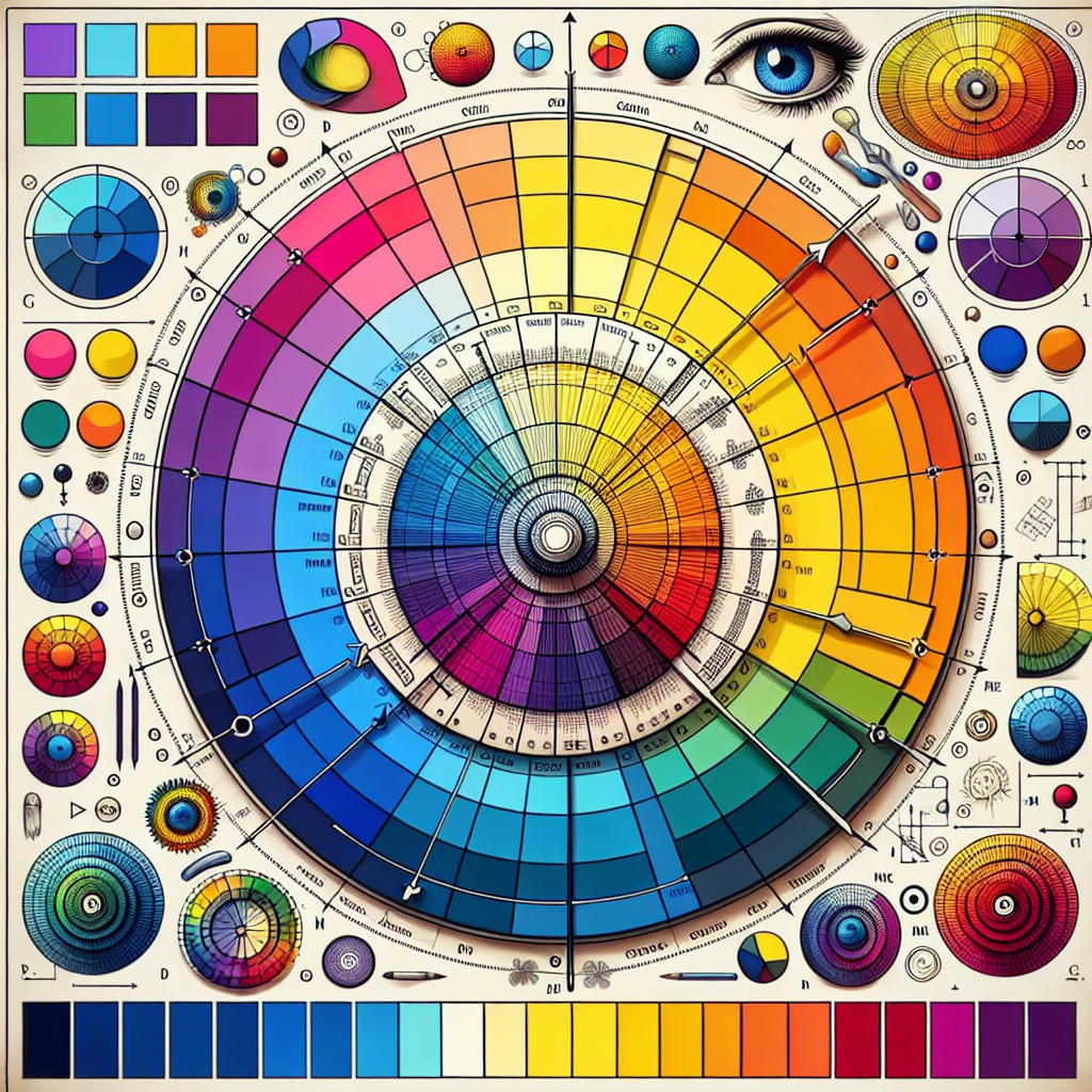
The Color Wheel
Die Farbtheorie ist ein faszinierendes Thema, das sich mit der Wirkung und Bedeutung von Farben befasst. Haben Sie sich jemals gefragt, warum bestimmte Farben harmonisch zusammenpassen, während andere eher unruhig wirken? Die Antwort liegt im Farbkreis, einem grundlegenden Werkzeug in der Welt der Farbgestaltung.
Primärfarben, Sekundärfarben und Tertiärfarben – Was verbirgt sich hinter diesen Begriffen und wie sind sie miteinander verbunden? Indem Sie ein Verständnis für die Beziehung zwischen den Farben entwickeln, können Sie gezielt Farbkombinationen auswählen, die Ihre Botschaft unterstreichen und die gewünschte Stimmung erzeugen.
Farbpsychologie – ein spannendes Forschungsfeld, das untersucht, wie Farben Emotionen, Verhalten und Entscheidungsprozesse beeinflussen können. Wussten Sie, dass bestimmte Farben wie Rot oder Blau bestimmte Reaktionen beim Betrachter hervorrufen können? Indem Sie dieses Wissen nutzen, können Sie gezielt Farben wählen, um eine bestimmte Wirkung zu erzielen.
Farbharmonie – das Geheimnis hinter ästhetisch ansprechenden Farbkombinationen. Durch die Verwendung von Farbschemata wie monochromatisch, komplementär oder triadisch können Sie sicherstellen, dass Ihre Designs visuell ansprechend und ausgewogen wirken. Werfen Sie einen Blick auf den Farbkreis und experimentieren Sie mit verschiedenen Kombinationen, um das perfekte Gleichgewicht zu finden.
Der Farbkreis ist ein mächtiges Werkzeug, das Ihnen dabei hilft, Farben bewusst einzusetzen und Ihre Designs auf ein neues Level zu heben. Indem Sie die Grundlagen der Farbtheorie verstehen und kreativ anwenden, können Sie gezielt Emotionen ansprechen, Markenbotschaften verstärken und beeindruckende visuelle Erlebnisse schaffen. Tauchen Sie ein in die Welt der Farben und lassen Sie sich von ihrer Vielfalt und Schönheit inspirieren.
Achieving Harmony in Color
Wenn es um die Farbtheorie geht, dreht sich alles um die Harmonie zwischen verschiedenen Farbtönen. Aber wie genau erreicht man diese harmonische Balance in einem Design? Es gibt verschiedene Faktoren, die dabei eine Rolle spielen. Zum einen spielt die Farbkreis-Theorie eine große Rolle. Komplementärfarben, Analogfarben oder Triaden können dabei helfen, die richtige Kombination zu finden. Aber auch Kontraste, Helligkeit und Sättigung sind wichtige Aspekte, die berücksichtigt werden müssen. All diese Faktoren zusammen ergeben eine stimmige Farbpalette, die das Auge erfreut.
Die Psychologie der Farben ist ebenfalls entscheidend. Jede Farbe hat eine bestimmte Bedeutung und kann verschiedene Emotionen hervorrufen. Rot steht beispielsweise für Leidenschaft und Energie, während Blau Ruhe und Vertrauen ausstrahlt. Wenn Sie also eine bestimmte Stimmung erzeugen möchten, ist es wichtig, die psychologische Wirkung der Farben zu berücksichtigen.
Aber auch der Einsatzzweck der Farben spielt eine große Rolle. In der Werbung werden oft knallige und kontrastreiche Farben verwendet, um Aufmerksamkeit zu erregen. Im Bereich des Webdesigns hingegen werden oft sanfte und harmonische Farbtöne eingesetzt, um eine angenehme Nutzererfahrung zu gewährleisten.
Zusammenfassend lässt sich sagen, dass die Farbtheorie ein komplexes Zusammenspiel aus verschiedenen Faktoren ist. Von der Auswahl der richtigen Farbkombinationen über die Berücksichtigung der psychologischen Wirkung bis hin zum Einsatzzweck der Farben – all diese Aspekte tragen dazu bei, eine harmonische und wirkungsvolle Farbgestaltung zu erreichen.
Color Temperature
Color temperature is a fundamental concept in color theory that helps you understand the color characteristics of light sources. It is measured in Kelvin (K) and describes the color appearance of a light source, ranging from warm tones (typically lower Kelvin temperatures) to cool tones (typically higher Kelvin temperatures). For example, candlelight has a warm color temperature of around 1500K, while a blue sky on a sunny day has a cool color temperature of around 10000K. Understanding color temperature is crucial in various fields, such as photography, interior design, and even in choosing the right light bulbs for your home.
Color Psychology
Color psychology explores how different colors can impact human emotions, behaviors, and perceptions. Each color has unique psychological effects. For instance, blue is often associated with calmness and trust, while red can evoke feelings of energy and passion. By incorporating color psychology into design elements, branding, or marketing materials, you can effectively communicate messages and evoke specific emotional responses from your audience. It’s essential to consider color psychology when making decisions about color choices in various contexts.
Color Harmonies
Color harmonies refer to combinations of colors that are visually appealing and balanced. Understanding different color harmonies, such as complementary, analogous, or triadic colors, can help you create aesthetically pleasing designs, artworks, or outfits. By applying color harmonies effectively, you can create visual interest, balance, and unity in your creations. Experimenting with different color schemes and harmonies can unleash your creativity and elevate the visual impact of your projects. Explore various color combinations to find the perfect harmony for your next creative endeavor.
In conclusion, color theory is a fascinating field that plays a significant role in many aspects of our lives. Whether you are choosing the right color for your living room walls, creating a captivating piece of art, or designing a brand logo, understanding color temperature, color psychology, and color harmonies can help you make informed and visually appealing choices. Embrace the colorful world around you, and let the principles of color theory guide you in your creative journey.
The Take Away
Die Bedeutung der Farbtheorie liegt darin, wie sie unser Verständnis von Farben und deren Wirkung auf unsere Emotionen und Reaktionen beeinflusst. Sie spielt eine wichtige Rolle in vielen Bereichen wie Kunst, Design, Marketing und Psychologie. Farben haben die Kraft, Stimmungen zu beeinflussen, Erinnerungen hervorzurufen und sogar das Verhalten von Menschen zu beeinflussen. Wie beeinflusst Farbe Ihre Entscheidungen im Alltag?
Die Farbpsychologie untersucht, wie verschiedene Farben auf das menschliche Verhalten wirken. Rot kann beispielsweise Aggression oder Leidenschaft auslösen, während Blau mit Ruhe und Vertrauen in Verbindung gebracht wird. Grüntöne können Beruhigung und Naturverbundenheit vermitteln. Wie reagieren Sie auf bestimmte Farben in Ihrer Umgebung und wie beeinflussen sie Ihr Empfinden?
Die Farbwahl kann auch in der Werbung eine entscheidende Rolle spielen. Unternehmen verwenden gezielt Farben, um bestimmte Emotionen oder Assoziationen bei Verbrauchern hervorzurufen. Rot wird oft für Sale-Schilder verwendet, um Aufmerksamkeit zu erregen, während Blau in Finanzwesen und Technologie verwendet wird, um Vertrauen und Zuverlässigkeit zu vermitteln. Wie beeinflussen Farben Ihre Einkaufsgewohnheiten?
Insgesamt hat die Farbtheorie einen großen Einfluss auf unser tägliches Leben, oft ohne dass wir es bewusst bemerken. Die Wahl der Farben in unserem Zuhause, in der Kleidung, die wir tragen, und in der Umgebung, in der wir uns befinden, kann eine starke Wirkung auf unser Wohlbefinden und unsere Stimmung haben. Welche Rolle spielen Farben in Ihrem Leben und wie beeinflussen sie Ihre Stimmung und Ihr Verhalten?
Where To Learn More
Color Theorie
Möchten Sie mehr über die faszinierende Welt der Farbtheorie erfahren? Farben haben eine enorme Auswirkung auf unsere Emotionen, Entscheidungen und Wahrnehmungen. Tauchen Sie ein in die Grundlagen der Farbpsychologie und entdecken Sie, wie Sie Farben gezielt einsetzen können, um Ihre Botschaft zu verstärken.
Kostenlose Online-Ressourcen
Es gibt zahlreiche kostenlose Online-Ressourcen, die Ihnen helfen können, Ihr Verständnis für Farben zu vertiefen. Von interaktiven Farbpaletten bis hin zu Video-Tutorials – Sie werden sicherlich eine Vielzahl von Informationen finden, die Ihnen helfen, Ihre Farbkenntnisse zu erweitern. Nutzen Sie diese Ressourcen, um Ihr Wissen aufzufrischen oder sich neue Techniken anzueignen.
Bücher und Fachliteratur
Für eine umfassendere Auseinandersetzung mit der Farbtheorie empfehlen sich Bücher und Fachliteratur. Von Klassikern wie „Interaction of Color“ von Josef Albers bis hin zu aktuellen Veröffentlichungen über Farbtrends und -psychologie – in Büchern finden Sie fundierte Informationen und Anleitungen, um Ihr Verständnis für Farben zu vertiefen.
Workshops und Seminare
Nichts geht über den direkten Austausch mit Experten und Gleichgesinnten. Besuchen Sie Workshops und Seminare, um Ihr Wissen über Farben praxisnah zu vertiefen. Tauchen Sie ein in interaktive Gruppendiskussionen, praktische Übungen und erhalten Sie wertvolles Feedback von erfahrenen Dozenten.
Bleiben Sie Neugierig
Egal, für welchen Weg Sie sich entscheiden, das wichtigste ist, dass Sie neugierig bleiben und kontinuierlich Ihr Wissen über Farben ausbauen. Farben sind ein faszinierendes und vielschichtiges Thema – es gibt immer etwas Neues zu entdecken und zu lernen. Wir wünschen Ihnen viel Spaß auf Ihrer Reise durch die Welt der Farbtheorie!
Reference
Die Bedeutung der Farbtheorie in der Gestaltung
Farben spielen eine entscheidende Rolle in der visuellen Kommunikation und können Emotionen, Stimmungen und Reaktionen beeinflussen. In der Designwelt ist es wichtig, die Grundlagen der Farbtheorie zu verstehen, um ansprechende und effektive Designs zu schaffen. Unterschiedliche Farben können unterschiedliche Assoziationen und Reaktionen hervorrufen. Zum Beispiel kann Blau Ruhe und Vertrauen vermitteln, während Rot für Leidenschaft und Energie stehen kann. Indem Sie die Farbtheorie nutzen, können Sie gezielt Botschaften kommunizieren und ein harmonisches Design schaffen.
Farbpsychologie und Emotionen
Die Farbpsychologie untersucht, wie Farben auf unsere Emotionen und Verhaltensweisen wirken. Bestimmte Farben können bestimmte Emotionen auslösen und so die Wahrnehmung und Reaktion der Betrachter beeinflussen. Rot wird oft mit Leidenschaft und Energie in Verbindung gebracht, während Grün für Wachstum und Harmonie steht. Durch die gezielte Auswahl von Farben können Designer Emotionen wecken, die gewünschten Reaktionen hervorrufen und die Benutzererfahrung verbessern.
Praktische Anwendung in der Gestaltung
Die Anwendung der Farbtheorie in der Gestaltung kann dabei helfen, eine konsistente Markenidentität zu schaffen und die Benutzerfreundlichkeit zu verbessern. Indem man Farben bewusst einsetzt, kann man die Aufmerksamkeit lenken, Hierarchien schaffen und die Lesbarkeit erhöhen. Darüber hinaus können Farben auch dazu beitragen, eine positive Stimmung zu erzeugen und das Markenimage zu stärken. Ein gut durchdachtes Farbschema kann das Gesamtbild einer Website oder eines Produkts maßgeblich beeinflussen.
Durch das Verständnis und die Anwendung der Farbtheorie können Designer gezielt und effektiv Farben einsetzen, um beeindruckende visuelle Erlebnisse zu schaffen und die gewünschten Reaktionen bei den Betrachtern hervorzurufen.